- Reviewed by handNo automated report. I go through your store myself.
- Mobile and desktopChecked on a phone and a laptop, the way customers shop.
- Three fixes, rankedThe changes most likely to grow sales, in the order I'd make them.
- Free, no obligationThe three fixes are yours to make however you like.
Real stores
Two real Shopify stores, reviewed the same way
I ran my review process on two well-known Shopify brands using only their public pages: what a customer sees on a phone, plus the speed and app data anyone can check. Neither brand is a client, and neither asked for this. Both are successful stores; even good stores have three things worth fixing.
Checked on 3 November 2026. Stores change often, so what you see today may differ.
Real storeNot a client
Death Wish Coffee
- Mobile speed score51Google PageSpeed, lab
- Main thread blocked1.6 stotal blocking time, mobile
- Layout shift, real users0.16Google's good mark is 0.1
- Requests5466 MB on the product page
- Apps and pixels6 + 24apps, plus tracking pixels
- ThemeDawn 10uploaded copy
Already working well: sizes are buttons rather than a dropdown, the size chart is on the page, and the brand is unmistakable on every screen.
- 1
Bring the price and Add to cart onto the first screen
Impact: highEffort: medium
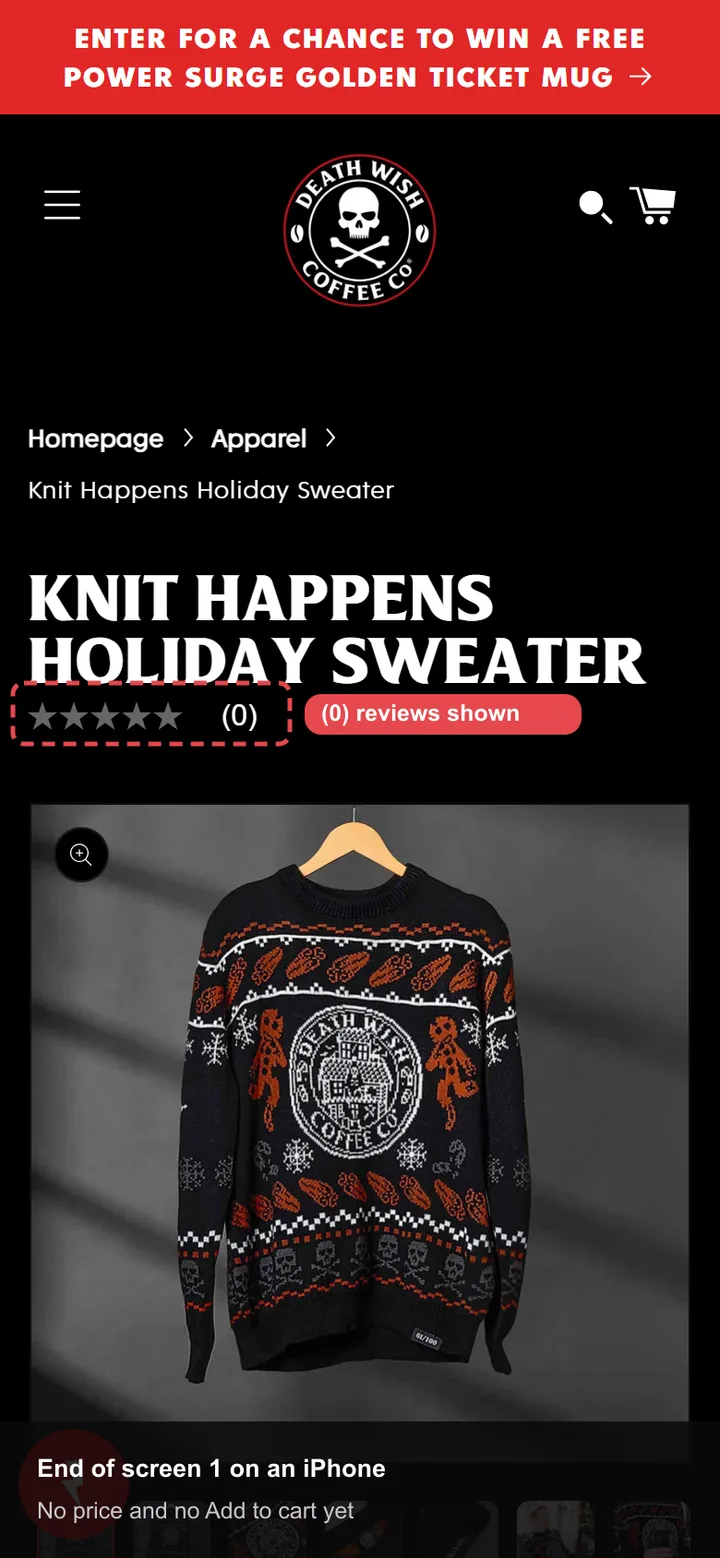
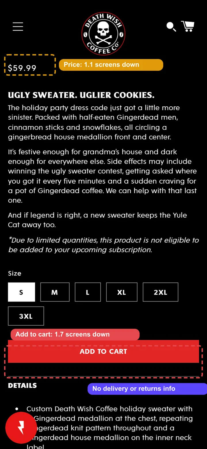
What I saw: on an iPhone the first screen is the title, a rating and the photo. The price starts 1.1 screens down and Add to cart at 1.7 screens, with no sticky button once you scroll past it, and no delivery or returns line near it.
The fix: move the price under the title, keep the gallery to about 60% of the screen, add a sticky Add to cart bar, and put one delivery and returns line under the button.
- 2
Hide the empty "(0)" rating
Impact: mediumEffort: low
What I saw: five grey stars and "(0)" sit right under the product name, on the first screen. An empty rating reads as "nobody has bought this yet".
The fix: show stars only once a product has reviews. Until then, show the store's overall rating or a line about its best-sellers; the home page shows its Gingerdead coffee at 4.5 stars from 261 reviews.
- 3
Cut the script load before adding anything new
Impact: mediumEffort: medium
What I saw: the product page makes 546 requests and blocks the main thread for 1.6 seconds in Google's mobile test. It runs 6 apps (Klaviyo, Smile.io, Bazaarvoice, Gorgias, Rebuy, Google Tag Manager) and 24 tracking pixels, and real-user layout shift is 0.16.
The fix: review the 24 pixels and remove duplicates, load the loyalty, chat and upsell widgets after the page is usable, and reserve space for the review widget so the page stops shifting.
Real storeNot a client
Brooklinen
- Mobile speed score33Google PageSpeed, lab
- Largest paint, real users3.2 sgood is 2.5 s or less
- Responsiveness, real users268 msgood is 200 ms or less
- Layout shift, real users0.15good is 0.1 or less
- Requests6577.8 MB on the product page
- Apps and pixels7 + 32apps, plus tracking pixels
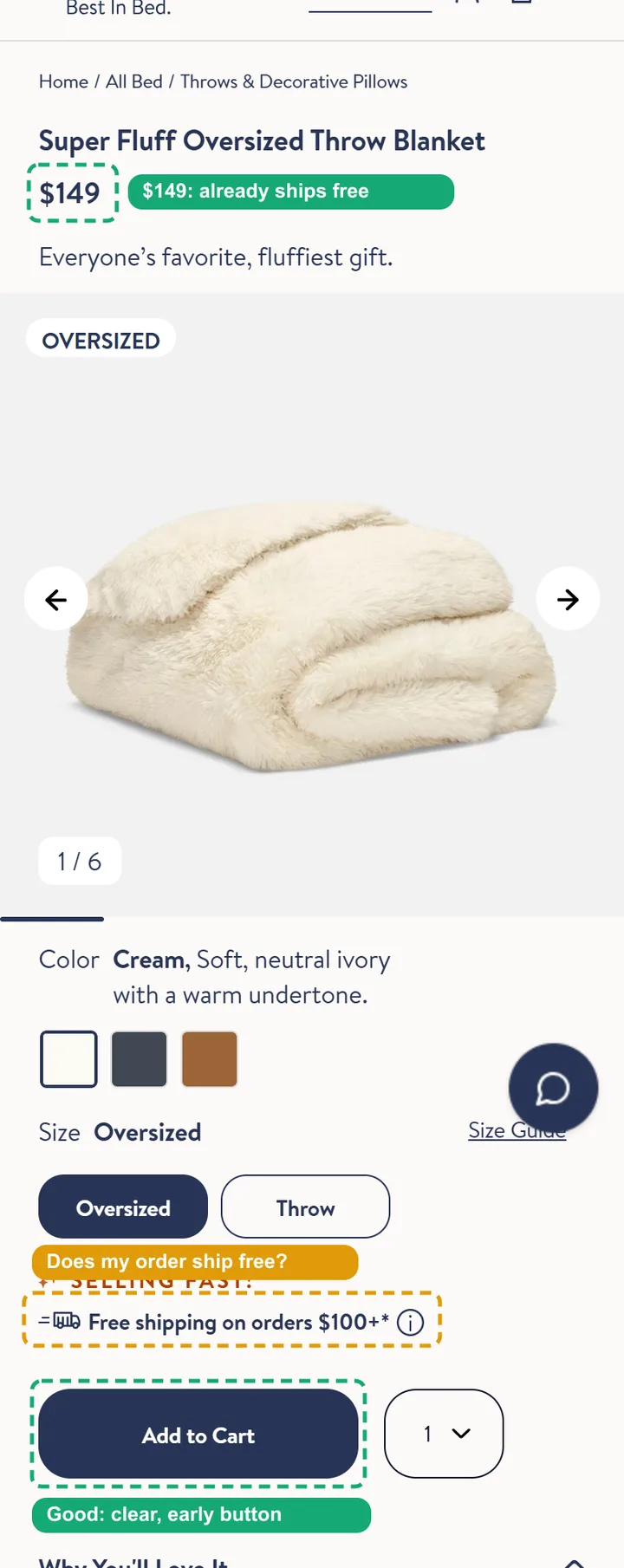
Already working well: Add to cart is close to the top, a sticky Add to cart bar follows you down the page, sizes are buttons, and the free-shipping line sits right next to the button.
- 1
Get the site passing Core Web Vitals on mobile
Impact: highEffort: high
What I saw: real Chrome users across the site get "needs improvement" on all three Core Web Vitals. Google's mobile test scores this product page 33, with 3.8 seconds of blocking time and about 1.5 MB of JavaScript that isn't used.
The fix: start with the 32 tracking pixels and the unused JavaScript, then load third-party widgets such as chat, wishlist and reviews only when they're needed, which is what holds responsiveness back.
- 2
Tell shoppers this item ships free
Impact: mediumEffort: low
What I saw: the throw costs $149, but the line by the button says "Free shipping on orders $100+", so the shopper has to work out that this one qualifies.
The fix: when the price is over the threshold, change the line to "Ships free" with a delivery estimate. It's a small, one-time change in the theme.
- 3
Show proof on products that have no reviews yet
Impact: mediumEffort: low
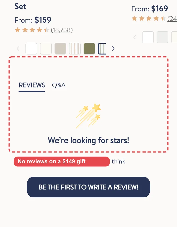
What I saw: this $149 gift shows "We're looking for stars!" with no reviews, while the sheets recommended on the same page show 18,738 reviews.
The fix: until a product has its own reviews, show the store's overall rating or a few reviews from the same collection, so a new product doesn't look untested.
How these were checked: screenshots on a 390 px phone screen; speed data from my Shopify speed checker (Google PageSpeed Insights and real-user Chrome data); apps and theme from my app detector and theme detector. I tested from outside the US, so country pop-ups and cookie banners appeared that US shoppers may not see; I closed those and left them out of the findings.
Full example
A complete review, written as the email you'd get
The real reviews above are short versions. Here is the full format, for a fictional store, with the detail your own review would include.
This is an example. The store is fictional, but the three issues are the ones I find most often when I review real Shopify stores. Figures marked "example" are for illustration.
Free 3‑point store review
A skincare brand on Shopify

Hi,
Thanks for sending your store. I went through it the way a first-time customer would, on my phone and on a laptop, from the home page to the cart. The store looks good and the products are clear. These are the three changes I'd make first, in order.
Delivery and returns are hidden on the product page
What I saw
Shipping cost, delivery time and the returns policy only appear in a collapsed tab below the description. On my phone that was four scrolls down. The first place a customer sees the shipping cost is the checkout.
Why it costs you sales
Unexpected costs at checkout are one of the most common reasons people abandon a purchase. A customer who can't find delivery details either goes looking for them or leaves to "check later", and many don't come back.
The fix
- Add one line under the price: Free delivery over $50 · Arrives in 3–5 days · 30-day returns.
- Repeat the same line in the cart drawer, next to the subtotal.
- Keep the full policy in the tab for people who want the detail.
Effort: a text block in the theme editor, about an hour. How to tell it worked: compare the add-to-cart rate on product pages for two weeks before and after, on mobile and desktop separately.
On mobile, add to cart is two screens down
What I saw
On an iPhone, the product gallery fills the whole first screen and the size is chosen from a dropdown. The add to cart button only appears after two full scrolls, and it's gone again once you scroll down to read the reviews.
Why it costs you sales
Most visits to a store like this come from phones. Every scroll and extra tap before the button is a chance to lose someone, and a dropdown hides which sizes are actually in stock.
The fix
- Keep the gallery to about 60% of the screen height on mobile, with a swipe to see more.
- Show sizes as buttons, with sold-out sizes crossed out rather than hidden.
- Add a sticky add to cart bar that appears once the main button scrolls out of view.
Effort: theme changes, about a day including testing on a duplicate theme. How to tell it worked: the add-to-cart rate on mobile product pages, and how many sessions scroll past the button without adding.
Apps slow down every page, even where they do nothing
What I saw
Every page loads a reviews widget, a chat widget, two pop-up apps and leftover code from an app that's no longer installed. The home page hero is a large image sent at full desktop size to phones.
Why it costs you sales
Google counts a page as good when its main content loads within 2.5 seconds for most visitors. Slow pages on mobile data lose people before they see a product, and page experience also feeds into search.
The fix
- Resize and compress the hero image, and serve a smaller version to phones.
- Remove the leftover app code and one of the two pop-up apps.
- Load the chat widget only on help pages, or after a visitor interacts.
Effort: about half a day, tested on a duplicate theme. How to tell it worked: mobile LCP in PageSpeed Insights straight away, then the Core Web Vitals report in Search Console over the next four weeks.
What loads on every page Example figures
- Hero image, desktop sizeResize
- Reviews widgetKeep
- Chat widgetDefer
- Pop-up app AKeep
- Pop-up app BRemove
- Leftover app codeRemove
Smaller things I noticed
Worth doing later, once the three fixes above are live:
- The newsletter pop-up opens after three seconds on mobile, before people have seen a product.
- Collection cards don't show review stars, so customers have to open each product to compare.
- The "Shop" menu opens a long list of links. Grouping them by skin concern would make it faster to scan.
How it works
From your store URL to three fixes
- 1Send your store
Your store URL, your email and, if you like, the problem you're trying to solve. It takes about a minute.
- 2I review it by hand
I go through the store on mobile and desktop, the way your customers do, and pick the three changes most likely to grow sales.
- 3You get your three fixes
A reply like the one above, by email. Make the changes yourself, or ask me for a quote. There's no obligation either way.
The free review is
- Three fixes, chosen and ranked by hand
- Based on what customers see on mobile and desktop
- Specific enough to act on yourself
It isn't
- A full audit of every page and your analytics
- A sales pitch, or a reason to sign anything
- An automated report
Need the full picture? The CRO audit covers your analytics and recordings, with a recorded walkthrough.
Free 3‑point review
Want three fixes like these for your store?
Send your store URL. I'll go through it by hand and reply with the three changes most likely to grow your sales.