Shopify guideGuide10 min read
Product Page Design: How to Build a Shopify Product Page That Converts
A product page sells when it answers questions in the order shoppers ask them. Here is the layout, the Shopify settings and the measurement routine I use to get there.
Key takeaways
- A product page converts when it answers the shopper's questions in the order they ask them: what is it, what does it cost, will it suit me, when will it arrive and can I send it back.
- On Shopify you can do most of this in the theme editor:
Online Store > Themes > Edit theme, then pick Products and the product template from the menu at the top. - Measure first. Shopify's Conversion rate breakdown report shows the share of sessions that add to cart, and a low add-to-cart rate points straight at the product page.
- Test one change at a time, starting with the buy box on mobile, where most of your traffic lands.
- Who it is for
- Store owners redesigning product pages
- Time needed
- A day per template, plus 2 to 4 weeks to measure
- What you need
- Theme editor access and 30 days of analytics
Most product pages I review don't have a design problem. They have an order problem. The price sits under a carousel, the delivery date lives in the footer, the size guide is three taps away, and a block of brand story pushes the Add to cart button below the first screen on a phone. The page looks good in a mockup and sells poorly in a shopper's hand.
This guide is the method I use when I redesign a Shopify product page as part of my Shopify CRO work: what each part of the page has to do, how to measure it before you change anything, and the exact theme editor settings to use. Setting names come from Shopify's Help Center and the source of Dawn, Shopify's free reference theme, as checked on 7 November 2026. Premium themes use different labels for the same ideas, so match them to your theme's documentation.
What a product page has to do
Every element on the page should answer a question a shopper has before they buy. If an element answers no question, it is decoration, and decoration pushes the answers further down. This is the map I work from:
| Element | Shopper's question | Where it goes |
|---|---|---|
| Title and price | What is it, and is it in my budget? | First screen, above the media on mobile or beside it on desktop |
| Media | What does it look like in real life? | First screen, swipeable on mobile |
| Variant picker | Does it come in my size or color? | Directly above the buy button |
| Buy button | How do I get it? | Visible without scrolling on a phone |
| Delivery and returns | When will it arrive, and what if it's wrong? | One line under the buy button |
| Reviews | Did it work for people like me? | Star rating under the title, full reviews lower down |
| Details and specs | Will it fit, work or last? | Collapsible rows below the buy box |
| Cross-sells | What else do I need with it? | Below the buy box, never above it |
Measure before you redesign
Redesigning without a baseline means you can't tell whether the new page is better. Take these numbers for the last 30 to 90 days before you touch the theme:
- Add-to-cart rate. In Shopify, go to
Analytics > Reportsand open Conversion rate breakdown. It shows all sessions, then sessions with cart additions, sessions that reached checkout and sessions that completed checkout. The step from all sessions to cart additions is where a weak product page shows up. - Device split. Open Sessions by device in the same reports list. If most sessions are on mobile, design and judge the page on a phone first.
- Product-level view-to-cart. In GA4, compare the
view_itemandadd_to_cartevents for your top 10 products. A product with plenty of views and few cart adds is your first redesign candidate, because the traffic is already there. - What people do on the page. Watch 20 or 30 session recordings of shoppers on that product page, with a heatmap or recording tool. Look for taps on images that aren't links, scrolling up and down between the price and the size guide, and rage taps on the variant picker.
Step 1: Get the first screen right
On a phone, the first screen decides whether a shopper scrolls or leaves. It should show the product, its name, the price, the star rating and, ideally, the variant picker and buy button. Here is how to set that up in a Shopify theme:
- Duplicate your theme. In
Online Store > Themes, open the actions menu on your live theme and duplicate it. Work on the copy. - Open the product template. Click Edit theme on the copy, then use the menu at the top of the editor to select Products and Default product.
- Reorder the blocks. In the Product information section, drag the blocks into this order: title, price, rating, variant picker, quantity selector, buy buttons, then a short description. Move long text blocks below the buy buttons.
- Set the media layout. In Dawn, the section's media settings include Layout (Stacked, 2 columns, Thumbnails or Thumbnail carousel) and Mobile layout. I usually pick a thumbnail carousel on desktop and a swipeable gallery on mobile, so the buy box stays close to the top.
- Turn on sticky content. Dawn's Sticky content setting keeps the product details in view on desktop while shoppers scroll the images.
- Check it on a real phone. The editor preview is useful, but open the preview link on your own phone and see where the buy button lands.
Step 2: Photos and video that answer questions
Product media does the work a shop assistant would do in person. Plan a shot list per product type instead of shooting whatever angles the photographer likes:
- The hero shot on a clean background, so the product reads at thumbnail size.
- Scale. The product in a hand, on a person or next to an everyday object.
- Detail. Texture, stitching, ports, labels: whatever shoppers would pick up and look at.
- In use. A short video of the product being used beats a paragraph of description.
- Every variant. If a color is sold, show it. Dawn's Hide other variant media after one is selected setting keeps the gallery focused on the chosen variant.
Shopify's media limits, from its Help Center: images up to 5000 x 5000 px (25 megapixels) and under 20 MB, with 2048 x 2048 px recommended for square images. Videos can run up to 10 minutes and 1 GB, in MP4, MOV or WebM, and you can also add YouTube or Vimeo links. 3D models are supported as GLB or USDZ files. Bigger files are not better: upload at the recommended size and let Shopify serve smaller versions to phones.
Step 3: Build the buy box
The buy box is the block of price, options and buttons. It is where small changes matter most, because every shopper who buys passes through it.
- Make the price clear. If a product is on sale, set a compare-at price on the product in the admin so the theme shows both prices. Show unit prices where they help comparison, such as for consumables.
- Choose the right variant picker. Dawn's Variant picker block has a Style setting with Pills or Dropdown. Pills work better when there are a handful of options, because shoppers see what is available in one glance. Use the drop-down only for long lists.
- Decide on express buttons. In the Buy buttons block, Shopify's Help Center calls the setting Show accelerated checkout buttons. Dawn labels it Dynamic checkout buttons. It adds a button for the shopper's preferred method, such as Shop Pay, under Add to cart. Keep it on for single-product purchases. For products people usually buy with others, test it, since it skips the cart.
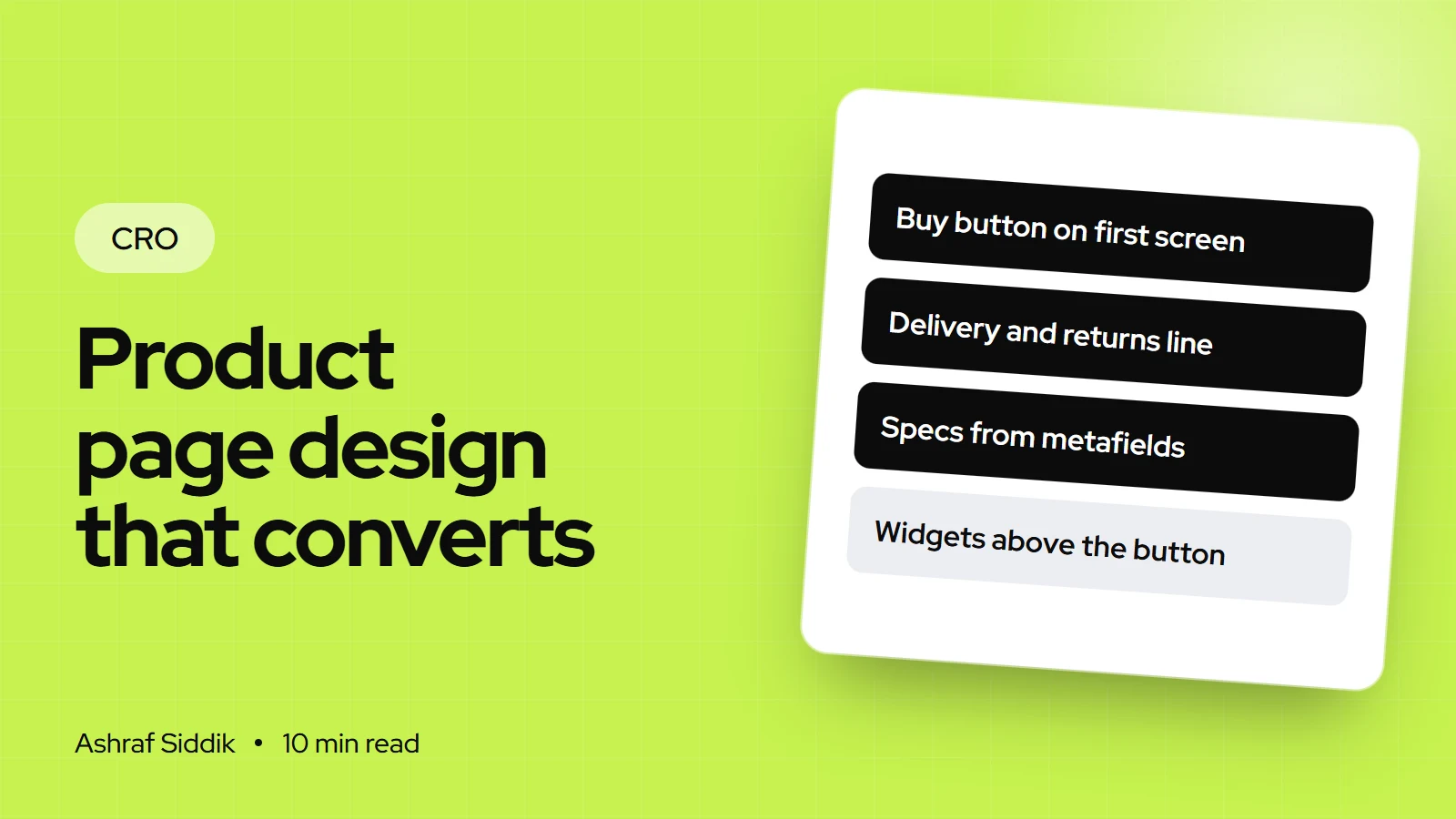
- Add one line on delivery and returns. Use a text block, or Dawn's Icon with text block, right under the buttons: when an order ships, what delivery costs and how returns work. Only state what is true for every order.
- Show stock only when it is real. Dawn's Inventory status block has a Low inventory threshold and an optional inventory count. Use it if you track stock and the number means something. My guide to using urgency without being pushy explains where that line sits.
Step 4: Details, specs and size help
Below the buy box, give the detail people need to decide, in a format they can scan. Long product descriptions rarely get read on a phone. Collapsible rows do.
- Use collapsible rows for materials, dimensions, care, ingredients, shipping and returns. In Dawn this is the Collapsible row block, which can pull its content from a store page.
- Put the size guide in a pop-up. Dawn's Pop-up block opens a store page in a modal, so build the size guide as a page once and link it from every apparel product.
- Store specs in metafields. Create product metafield definitions, for example "Material" or "Dimensions", from
Settings > Metafields and metaobjects, or from the Metafields section of any product. Then connect them to blocks in the theme editor as dynamic sources. One template can then show the right specs for every product, and you edit the data, not the theme.
Write the description for scanning: a one-line summary of who it is for and what it does, then three to five benefit bullets, then the specs. Keep the brand story for the About page and one image-with-text section lower down.
Step 5: Reviews and cross-sells
A star rating under the title answers "is this any good?" before the shopper scrolls. Full reviews, with photos where you have them, belong after the details, so people who need more reassurance find it. Dawn has a Product rating block that shows ratings from a compatible review app. If you are still choosing an app, my Judge.me vs Okendo comparison covers the two I set up most often.
Cross-sells should add to an order, not compete with the product. Shopify's own Search & Discovery app handles this without extra apps:
- Open the app. Go to
Apps > Search & Discoveryand click Product recommendations, then Add recommendations. - Pick the product and add up to 10 complementary products (bought together) and up to 10 related products (alternatives).
- Add the block. In the theme editor, add the Complementary products block to the Product information section, below the buy buttons. Only one such block can appear on a product page. Related products show through the theme's related products section further down.
Shopify's own guidance is to choose complementary items that cost the same as the main product or less, which matches what I see: a small add-on is an easy yes, while a second big purchase makes people stop and think.
What to test first
Once the page is rebuilt, test the changes that touch the most buyers first. If your traffic allows it, run them as A/B tests, as described in my guide on how to A/B test a Shopify store. If not, make one change, measure for two to four full weeks against your baseline, and keep notes.
| Test | Why first | Watch |
|---|---|---|
| Buy box above the fold on mobile | Every mobile buyer sees it | Add-to-cart rate |
| Delivery and returns line | Removes the top reason to hesitate | Add-to-cart, reached checkout |
| Variant pills vs drop-down | Fewer taps to choose | Add-to-cart rate |
| Lead image or video first | Sets the first impression | Add-to-cart, bounce rate |
| Accelerated checkout buttons on or off | Trades speed against cart size | Conversion rate, order value |
Common product page mistakes
- Designing on a desktop monitor. The page that matters is the one on a phone.
- Stacking app widgets above the buy button. Badges, timers and bundle boxes push the decision down the page and slow it down.
- Hiding shipping costs until checkout. Shoppers find out anyway, just later and with more annoyance.
- One description template for every product. A candle and a jacket need different answers. Use metafields and alternate templates instead.
- Images that don't match the selected variant. Shoppers pick a color and still see another one.
- Changing five things at once. If sales move, you won't know which change did it.
Product page design checklist
| Area | Check | Done when |
|---|---|---|
| Baseline | Add-to-cart rate recorded | Numbers saved for 30 to 90 days |
| First screen | Title, price, rating, buy button | All visible on a phone |
| Media | Hero, scale, detail, in use | Every variant has its own image |
| Buy box | Clear price and variant picker | Options visible in one glance |
| Delivery | Shipping and returns line | True for every order |
| Details | Collapsible rows, size guide | Specs come from metafields |
| Proof | Rating near title, reviews below | Review app connected |
| Cross-sells | Complementary block below buttons | Add-ons cost the same or less |
Next steps
Pick your highest-traffic product with the weakest add-to-cart rate, rebuild its template on a duplicate theme using the steps above, and publish it after checking it on a phone. Then give it at least two full weeks before you judge the result, and compare it against the baseline you saved.
If you'd rather have a specialist look at it first, send me the page. I'll review it for free and tell you the three changes I'd make first, in order. When you want the work done for you, my Shopify CRO service starts from $500.
Free tools
Check your own store
Free, no sign-up. Each one runs a part of this guide for you.
Frequently asked questions
What makes a good product page design?
A good product page answers the shopper's questions in order: what it is, what it costs, whether it suits them, when it arrives and how returns work. On a phone, the title, price, rating and buy button should all be visible on the first screen.
How do I change the product page layout in Shopify?
Go to Online Store > Themes, click Edit theme, and choose Products and your product template from the menu at the top. In the Product information section you can reorder blocks and change the media layout. Duplicate the theme first so you can test changes safely.
How do I know if my product page is the problem?
Open the Conversion rate breakdown report in Shopify analytics and look at sessions with cart additions. If few sessions add to cart compared with your other products or your store average, the product page is the first place to look.
Should I use a product page template or a custom design?
Most stores do well with their theme's product template, set up properly with the right block order, metafields and alternate templates for different product types. A custom section is worth it when your products need something the theme can't show, such as a configurator or a detailed comparison.
Where should reviews go on a product page?
Put the star rating under the product title, where it answers the quality question early. Place full reviews after the details and specs, so shoppers who want more reassurance can find them without pushing the buy button down.
Do accelerated checkout buttons help on product pages?
They help shoppers who buy one item and want to pay fast with Shop Pay or another saved method. Because they skip the cart, they can reduce add-on purchases, so stores that rely on cross-sells should test them before deciding.
Sources
- Adding and removing accelerated checkout buttons, Shopify Help Center
- Product media types, Shopify Help Center
- Product recommendations in Search & Discovery, Shopify Help Center
- Creating custom metafield definitions, Shopify Help Center
- Behavior reports, Shopify Help Center
- Dawn theme source code, Shopify (GitHub)
Related services and work

I'm a Shopify developer and CRO specialist. I have built and improved Shopify stores since 2018, completed more than 1,000 projects, and hold a 4.96 average rating across 719 client reviews.
More guides
-
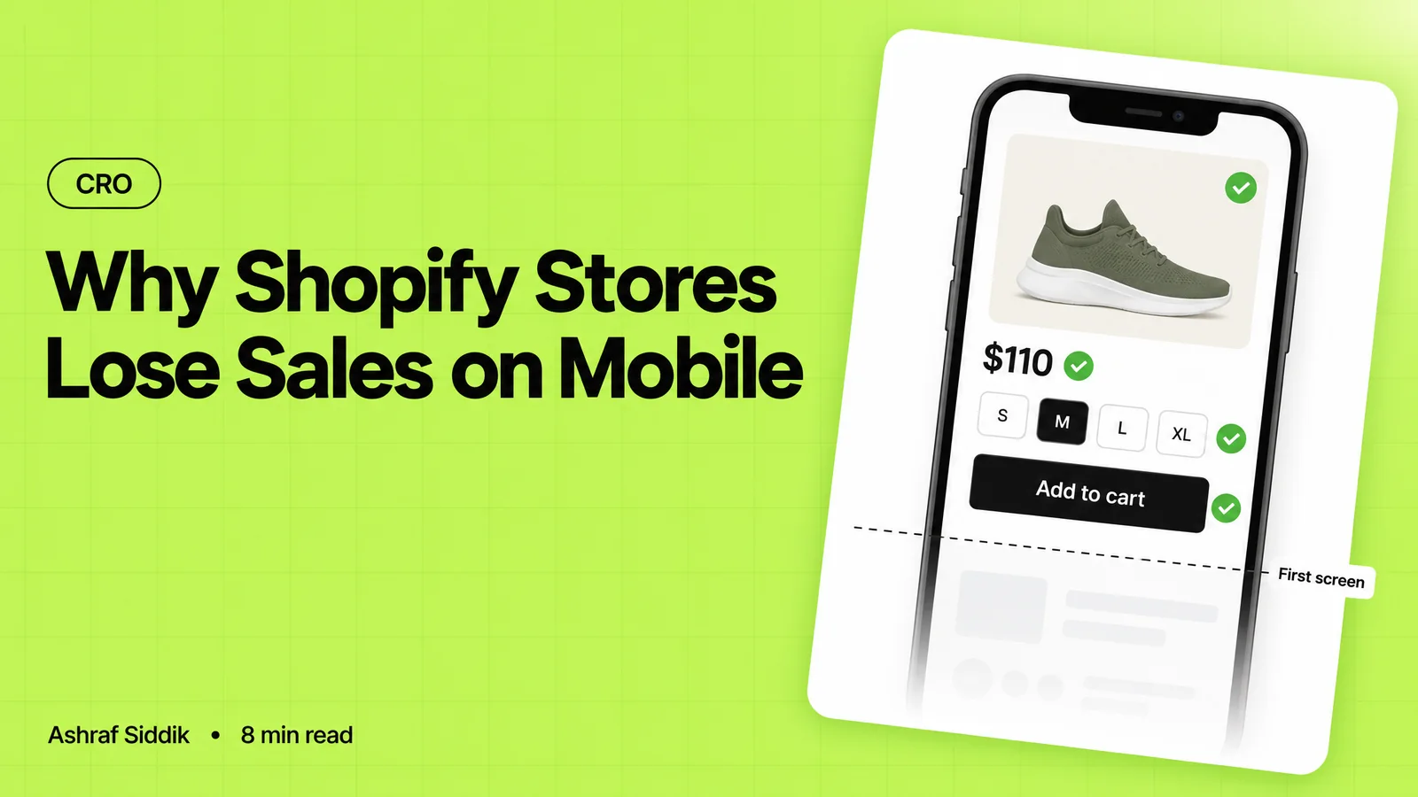
Why Shopify Stores Lose Sales on Mobile: A Practical CRO Checklist
Mobile visitors decide fast, with one thumb and plenty of distractions. Here is how to find the leaks on a Shopify store and fix them in the right order.
-
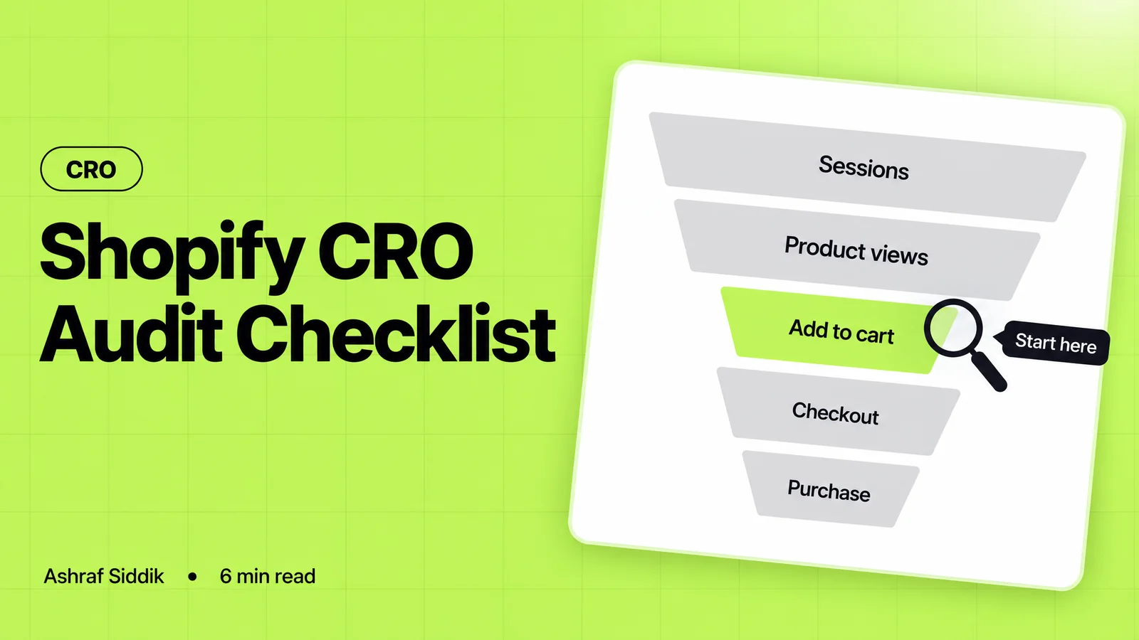
Shopify CRO Audit Checklist for DTC Brands
The checklist I use to audit DTC Shopify stores, from checking that the data can be trusted to deciding which fixes to ship first.
-
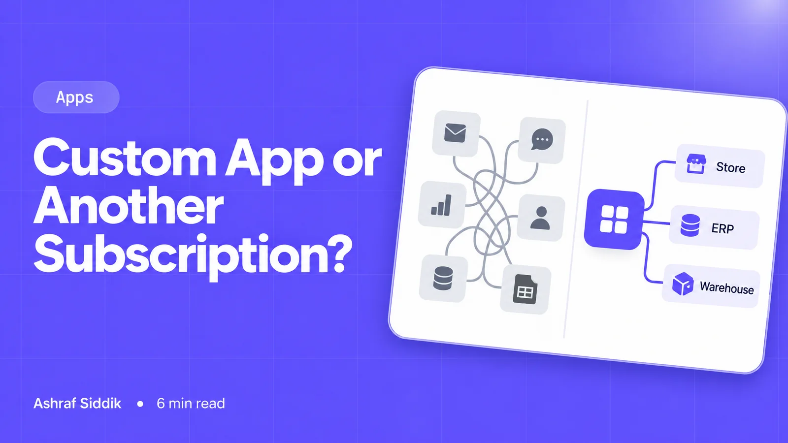
When to Build a Custom Shopify App Instead of Adding Another Subscription
Another subscription is the quickest fix, until you are paying for five apps that still don't match how your business works. Here is how to decide.
-
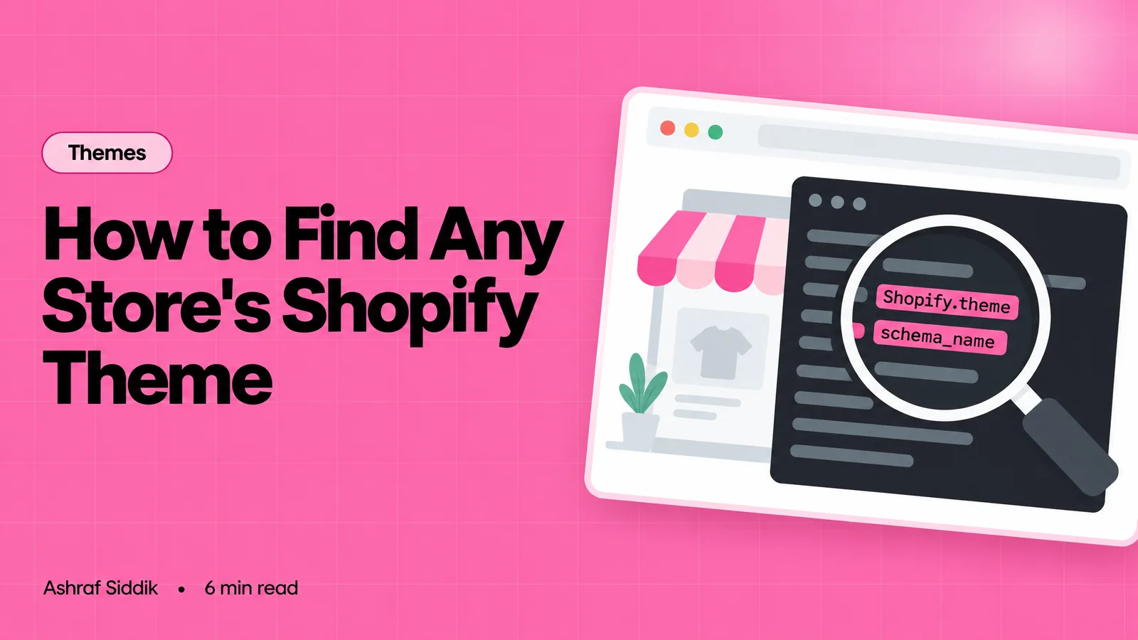
How to Find Out What Theme a Shopify Store Uses
Every Shopify store names its theme in the page code. Here is where to look, how to read what you find, and what it means for your own theme choice.
-
How to See What Apps a Shopify Store Uses
Apps leave traces in a store's page code: scripts from their own servers, app embed folders and pixel settings. Here is how to read them, and what to do with the list.
-
How to Name a Shopify Store (and Check the Name Is Free)
A store name has to be easy to say, free as a domain and a handle, and clear of other brands. Here is the process I use with clients, and what Shopify lets you change later.