Shopify guideGuide7 min read
How to Make Your Shopify Store Look Premium
A premium-looking Shopify store comes from a few consistent decisions, not an expensive theme. This guide walks through them in the order I work, using the theme editor and a little custom CSS.
Key takeaways
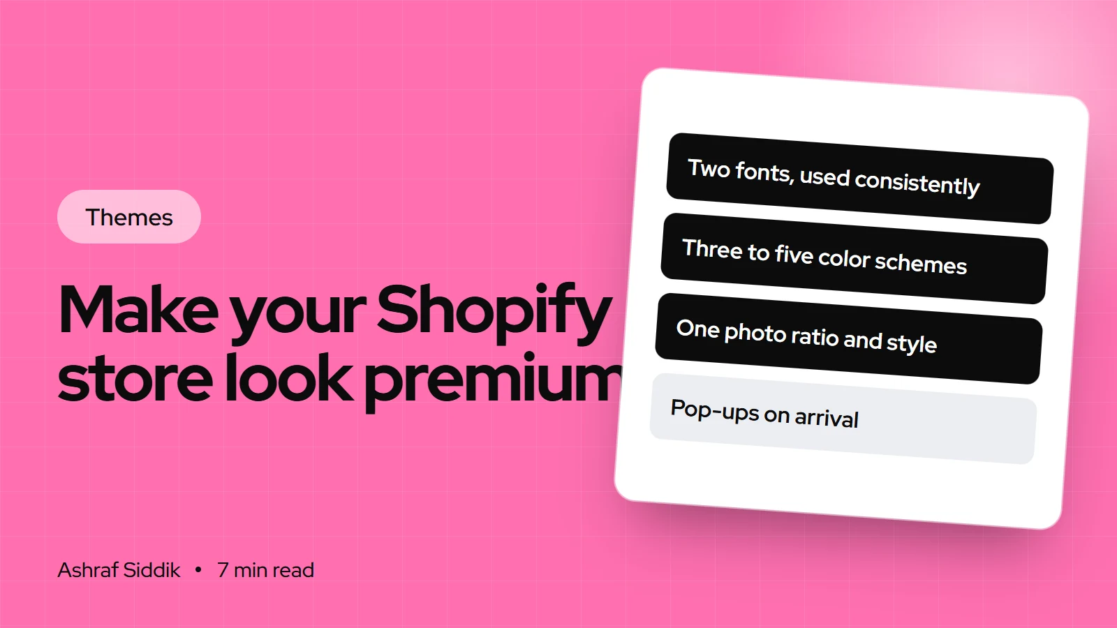
- A premium Shopify store design comes from restraint and consistency: two fonts, three to five color schemes, generous spacing and photography in one style. It rarely comes from a more expensive theme.
- Set fonts, colors, spacing, buttons and cards once in
Theme settingsso every section inherits them, instead of styling sections one by one. - Photos do most of the work. Use one aspect ratio for product images and set product cards to Square or Portrait so the grid lines up.
- Premium also means fast and calm on a phone. Every pop-up, badge, animation and app widget you remove makes the store feel more expensive.
- Who it is for
- Store owners whose store looks dated
- Time needed
- A day for the full pass
- What you need
- Admin access and brand fonts and colors
When a store owner tells me their site "looks cheap", the theme is almost never the problem. I see the same free theme looking like a market stall on one store and like a design studio on the next. The difference is a set of decisions about type, color, space and images, applied consistently.
This guide is the process I follow to make a Shopify store look premium, using the theme editor and, where it helps, a few lines of custom CSS. Setting names and limits come from Shopify's help center and the Dawn theme's settings as I checked them on 7 November 2026. Your theme may name things slightly differently, but every current Shopify theme has the same groups.
Step 1: Audit the store on your phone
Most of your shoppers will judge the store on a phone screen, so start there. Open the home page, a collection and a product on your phone and take screenshots. Then look at them side by side and note:
- How many fonts and font weights you can count.
- How many different background colors and button styles appear.
- Whether product photos share a shape, background and lighting.
- How much is competing for attention above the fold: banners, badges, pop-ups, chat bubbles.
Before you change anything, duplicate the theme from Online Store > Themes (actions menu, then Duplicate) and work on the copy. If you want to see how a store you admire is built, the Shopify theme detector tells you which theme it runs, which is often a free one.
What separates budget from premium
| Element | Looks budget | Looks premium |
|---|---|---|
| Fonts | Three or more, many weights | One heading, one body font |
| Color | A new background per section | Three to five schemes, one accent |
| Spacing | Sections pressed together | Even, generous space |
| Photos | Mixed shapes and backgrounds | One ratio, one lighting style |
| Buttons | Heavy shadows, several styles | One solid, one outline style |
| Above the fold | Pop-up, badges, countdown | One image, one message, one button |
| Copy | Long, shouty headlines | Short, specific, calm |
Step 2: Fix the typography
Open the copy with Edit theme and click the settings icon, then Typography.
- Pick one heading font with character. A refined serif or a distinctive sans for headings is where your brand voice shows.
- Pick a plain body font. It should disappear into the reading. Shopify recommends system fonts for speed, and fonts from Shopify's font library load quickly too.
- Use the scale, not more fonts. Free Shopify themes let you scale type from 100% to 150%. In Dawn, headings go to 150% and body text to 130%. Larger headings with a normal body size create hierarchy without extra fonts.
- Tighten long headings. Big headings often look better with slightly reduced letter spacing, which you can add with custom CSS (see Step 7).
Step 3: Build a small color system
Most current themes use color schemes: sets of background, text and button colors you apply per section. You can have up to 21. Premium stores use three to five. Newer themes, such as Horizon 4.0.0 and later, use a color palette instead, where changing one brand color updates every setting that uses it.
A color system that looks considered
- Base scheme1Off-white or warm neutral background, near-black text. Most sections use it.
- Contrast schemes2One dark, one tinted brand color, for banners and story sections.
- Accent color1Used only for primary buttons and key links.
Pure white with pure black can feel harsh. A slightly warm off-white with a very dark gray reads as more expensive. Keep body text dark on light backgrounds and check contrast, because pale gray text on a beige background looks elegant on a designer's monitor and unreadable on a phone in sunlight.
Step 4: Give everything room
Space is the cheapest premium signal there is. In Theme settings > Layout, set the page width and the space between template sections. In Dawn, page width runs from 1,000 to 1,600 px. I usually set it around 1,200 to 1,400 px so text lines don't stretch too wide on large screens.
Then check each section's top and bottom padding and make them consistent. One section with 80 px of padding next to another with 20 px looks accidental. Fewer, larger sections almost always beat many small ones.
Step 5: Make the photography consistent
No theme setting fixes mismatched photos. Decide on one aspect ratio for product images, one background (white, a brand color or a styled set) and one lighting style, and reshoot or re-edit the outliers.
- Grid images. In your collection grid settings, set the image ratio to
SquareorPortraitinstead of adapting to each image. In Dawn this is theImage ratiosetting on the Product grid section. - Second image on hover. Turn it on only if every product has a good second photo, such as the product in use.
- Hero images. One strong lifestyle photo beats a slideshow of five. Keep text short enough to read on a phone over the image.
- File limits. Shopify accepts JPEG, PNG, GIF, HEIC and WebP up to 20 megapixels and 20 MB. Shopify resizes images for each screen, so upload good quality and let the theme handle sizes.
Step 6: Refine buttons, cards and details
These small settings live in Theme settings under groups such as Buttons, Product cards, Badges and Animations.
- Buttons. Pick a corner radius and use it everywhere. Remove heavy shadows. Dawn's button radius runs from 0 to 40 px; square or slightly rounded corners tend to look most refined.
- Product cards. Align text consistently and keep vendor names off unless you sell several brands.
- Badges. One sale badge style in a quiet color scheme. Several bright badges per card look like a discount store.
- Animations. A subtle reveal on scroll is fine. Choose a calm hover effect, or none.
- Announcement bar. One message, not a rotating carousel of four.
Step 7: Add finishing touches with custom CSS
When settings run out, custom CSS covers small refinements without editing theme files. Store-wide CSS goes in Theme settings > Custom CSS and is limited to 1,500 characters. Each section has its own Custom CSS box at the bottom of its settings, limited to 500 characters and scoped to that section.
h1, h2, .h1, .h2 {
  letter-spacing: -0.02em;
  line-height: 1.1;
}
.rte p {
  max-width: 65ch;
}
A few rules apply: @import isn't allowed, the content property isn't available, and URLs must point to cdn.shopify.com. Class names differ between themes, so check yours with your browser's inspector before you write a rule. Anything bigger than these boxes allow belongs in the theme code or a custom section.
Step 8: Make the product page feel considered
The product page is where a premium impression turns into a sale, so it deserves the most care.
- Gallery. Large images, zoom or a lightbox, and a layout that suits your photo count.
- Clear hierarchy. Title, price, options and the add to cart button in that order, with nothing loud between them.
- Swatches and pills. Visual options for color and size, instead of dropdowns, when there are only a few values.
- Details in collapsible rows. Materials, care, shipping and returns, tucked away but easy to find.
- Quiet reassurance. A short line on delivery and returns near the button, not a wall of trust badges.
My mobile CRO checklist covers the conversion side of the same page.
Common design mistakes
- Switching themes to fix a design problem. The same inconsistencies move with you.
- Adding a font for every section. Hierarchy comes from size and weight, not more typefaces.
- Using every color scheme. Twenty-one schemes are a limit, not a target.
- Stock photos next to real product shots. Shoppers notice the mismatch.
- Stacking pop-ups and widgets. An email pop-up, a chat bubble and a spin-to-win wheel on arrival make any design look cheap.
- Designing on desktop only. Check every change on a phone.
Premium design checklist
- Duplicate the theme and screenshot the current store on a phone.
- One heading font, one body font, hierarchy through scale.
- Three to five color schemes with one accent color.
- Consistent page width and section spacing.
- Product photos in one ratio and style, cards set to Square or Portrait.
- One button style, quiet badges, calm animations.
- Small refinements in custom CSS, within the character limits.
- Fewer pop-ups and widgets, and a speed check after changes.
Next steps
Work through the steps in order: type and color first, photos last. If your theme can't produce the layout you have in mind even after this, compare Dawn with premium themes before you buy, and see what a custom Shopify theme costs. Store design and development with me starts from $300 with a fixed quote, and the Shopify development page explains how it works.
Free tools
Check your own store
Free, no sign-up. Each one runs a part of this guide for you.
Frequently asked questions
How can I make my Shopify store look more professional?
Limit yourself to two fonts and three to five color schemes, give sections consistent spacing, and make product photos share one ratio and style. Set these in Theme settings so every section inherits them, then remove pop-ups and badges that compete for attention.
Do I need a paid theme for a premium Shopify store design?
No. Free Shopify themes like Dawn can look premium with good typography, color and photography. A paid theme helps when you need specific features or layouts the free themes don't have, not for looks alone.
How do I customize my Shopify store design?
Go to Online Store, then Themes, and click Edit theme on a duplicate of your theme. Change fonts, colors, layout, buttons and cards in Theme settings first, then adjust each page's sections. Small refinements can go in the Custom CSS boxes.
How much custom CSS can I add in the Shopify theme editor?
Store-wide custom CSS in Theme settings is limited to 1,500 characters, and each section's Custom CSS box is limited to 500 characters and scoped to that section. Larger changes belong in the theme code.
What image sizes should I use for a premium-looking store?
Shopify accepts images up to 20 megapixels and 20 MB, and resizes them for each screen. More important than size is consistency: pick one aspect ratio for product images and set your collection grid to Square or Portrait so cards line up.
How many fonts should a Shopify store use?
Two is enough for almost every store: one heading font with character and one plain body font. Use the theme's font size scale to create hierarchy instead of adding more typefaces.
Sources
- Customizing Theme Settings, Shopify Help Center
- Color customization settings, Shopify Help Center
- Adding custom CSS, Shopify Help Center
- Theme images, Shopify Help Center
- Dawn theme source code, Shopify on GitHub
Related services and work

I'm a Shopify developer and CRO specialist. I have built and improved Shopify stores since 2018, completed more than 1,000 projects, and hold a 4.96 average rating across 719 client reviews.
More guides
-
How to Build Custom Sections in Shopify
A custom section adds exactly the layout your store needs and stays editable in the theme editor. This tutorial builds one from an empty file to a tested, reusable section.
-
Shopify Liquid Basics for Store Owners
Liquid is the language every Shopify theme is written in, and you can learn to read it in an afternoon. This guide covers the basics with code examples you can test safely on your own store.
-
How to Set Up Product Filters in Shopify
Good filters help shoppers find the right product in seconds, and bad product data breaks them. This guide shows how to set up Shopify product filters properly, from data cleanup to theme settings.
-
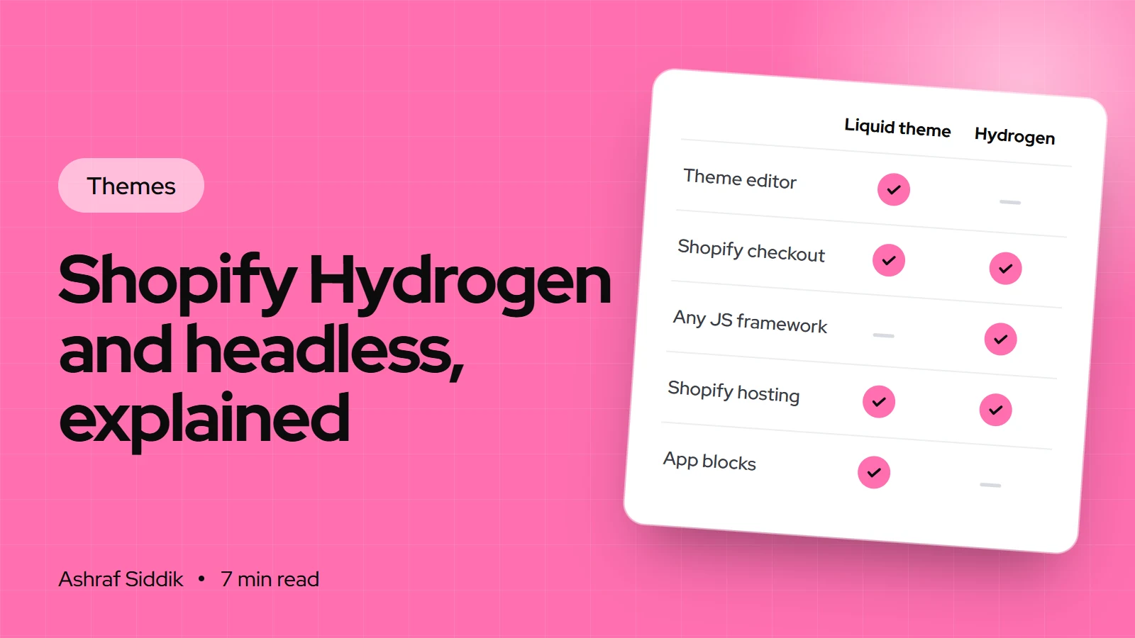
Shopify Hydrogen and Headless Commerce Explained
Hydrogen lets developers build a Shopify storefront in React and host it on Oxygen. This guide explains how it works, how it compares with Liquid, and how to tell whether your store needs it.